Wurth JD Creator is an internal web application that helps HR teams build complete and consistent job descriptions. Before this tool, HR teams worked through scattered templates, emails, and older documents. This often resulted in missing information, inconsistent formatting, and significant time lost in assembly and review.
My role was to design a unified system that would simplify creation for HR users and provide oversight and management capabilities for Admins. I shaped the information architecture, dashboard layouts, form flows, and interaction patterns. The goal was to reduce effort, increase accuracy, and create a long term structure that could scale into reporting and performance measurement.
BLUF
I redesigned Wurth’s job description workflow by converting a slow, manual process into a structured digital system with clear role based experiences for HR and Admin users. I created dashboards, navigation, and form architectures that made JD creation faster, more consistent, and easier to manage. By separating responsibilities, defining information hierarchy, and planning for future reporting, I built a scalable foundation that improved accuracy, speed, and visibility across the organisation.
Situation
When I joined the project, the client had a mix of requirements, references, and expectations. They wanted an online tool that made job description creation more predictable and less manual. HR teams needed a simple workflow that captured all required information in one guided process. Admins needed visibility across all HR accounts so they could track activity, manage users, and prepare for quarterly business reporting.
However, the inputs were scattered. The client shared multiple visual references that looked modern but lacked clarity in hierarchy and function. There was no defined navigation, no separation of responsibilities, and no structure for scaling into reporting. My task was to convert these loose ingredients into a functioning product with clear decisions about roles, data, and workflows.
Tasks - High level Responsibilities
I handled the following responsibilities:
• Understanding HR needs, pain points, and current workflows
• Defining the information architecture for the entire product
• Designing the HR and Admin dashboards
• Creating structured form flows for complete job descriptions
• Establishing role based access and permissions
• Planning the system so it could support future reporting
• Bringing clarity to layout, hierarchy, and spacing
• Reviewing the design later to identify improvements with a mature UX lens
Actions
Mapping all requirements into a structured information architecture
I started by collecting every piece of information the client provided. I separated them into functional needs, visual preferences, and reporting expectations. From this, I defined the core entities of the system: job descriptions, HR accounts, and Admin oversight tools. This allowed me to create a stable information architecture that the team could build on.
Establishing separate experiences for HR and Admin
To simplify the user experience, I created two distinct entrances into the product. HR users focused only on creating and managing their own job descriptions. Admin users managed HR accounts, viewed all forms, and tracked organisational activity. This separation reduced clutter and allowed each user type to stay focused on their work.

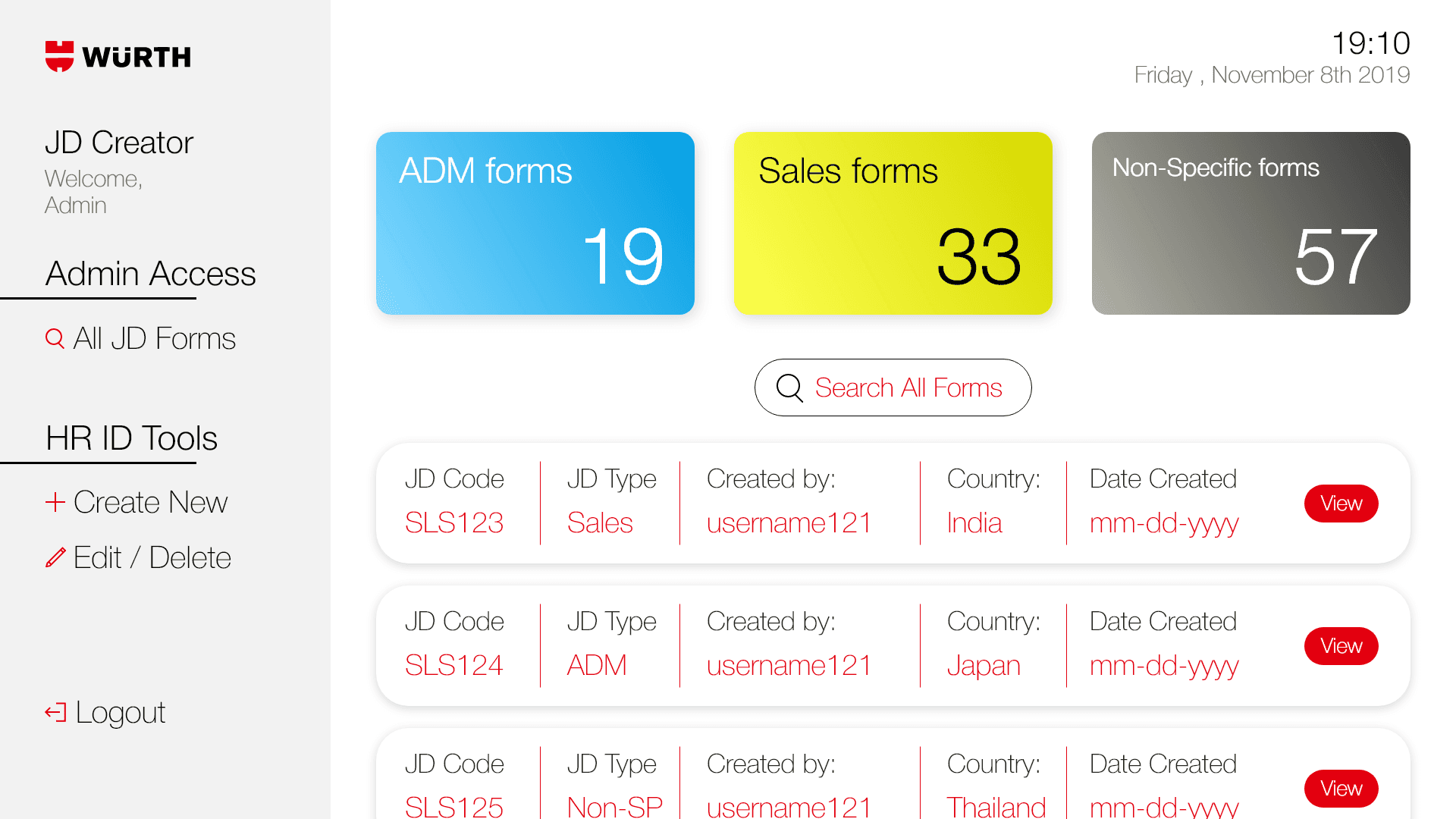
Designing the Admin dashboard
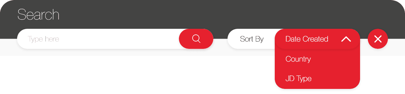
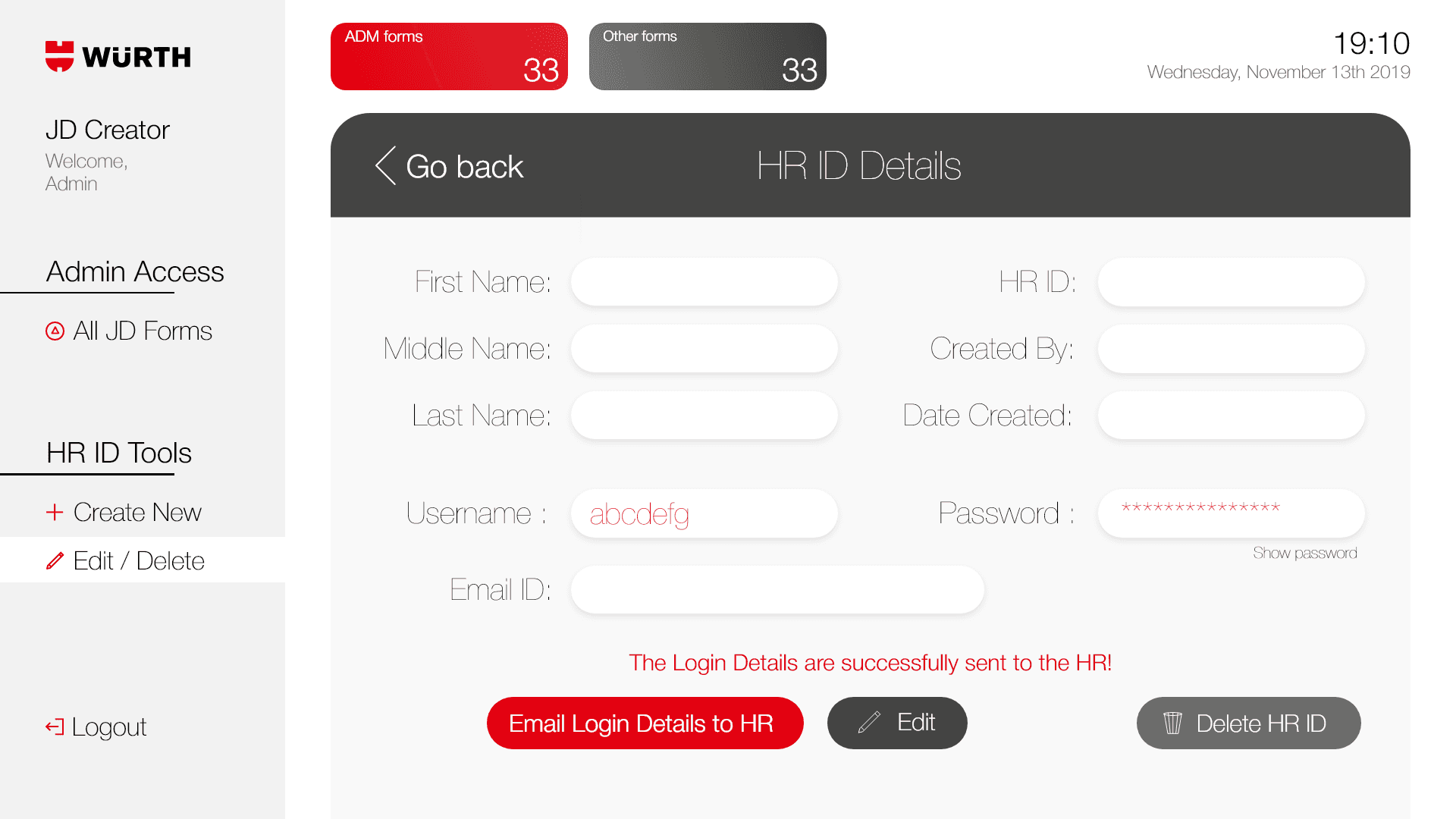
The Admin dashboard became the central overview for the organisation. I designed it with a left aligned navigation system and a clean table layout that displayed all job descriptions created across HR accounts. Admins could sort, filter, and search through the forms, and they had access to HR ID management screens where they could review details and send login information.

Designing the HR dashboard
HR users needed speed and clarity. I designed a minimal dashboard that showed only their created job descriptions. The layout highlighted the option to create a new JD, review existing ones, and search for specific entries. The intention was to make creation and editing feel straightforward and predictable.
Problem Statement
The problem statement provided by client was that the creation of job description was taking too much manual time which they wanted to streamline using digital form and auto generated fields. The client wanted the web app which is quickly editable and can help an HR employee to create a JD with all the necessary information in a single go.
My Process
I received inputs from our client at Wurth, outlining the requirements for different forms, views, screens which they want to see as data sets. The dashboard design was inspired by a moodboard featuring various references from Dribbble.
I worked with the client to gather all of their inputs, define all the design choices, understood their color theory and shared the first draft of the HR dashboard with the left side navigation bar. I suggested the client to have two different login pages in the web application. One for the admin and other for all the HRs. The HR view shall have a focused dashboard for the single user, whereas the admin can view all forms created by multiple HR IDs all together.
The admin view shall help create the quarterly business reports(QBRs) for the client showing a segregation of administration(ADM) forms, sales forms and other non-specific forms.
Admin View
The Admin can create HR IDs and edit/create JD Forms
Search Bar
The Admin can search
HR ID details
HR ID details could be edited with a quick option to email login details to specific HR.
The project covered all major requirements that keep the concept to be client focused. The color theme was provided by the client hence the colors were used in this way.
I understood that there were a lot of mistakes from UX standpoint like use of colours as well as list structure. With the learnings I now have in the field of UX, the list headers could have been simpler and the colours could be more accessibility friendly.